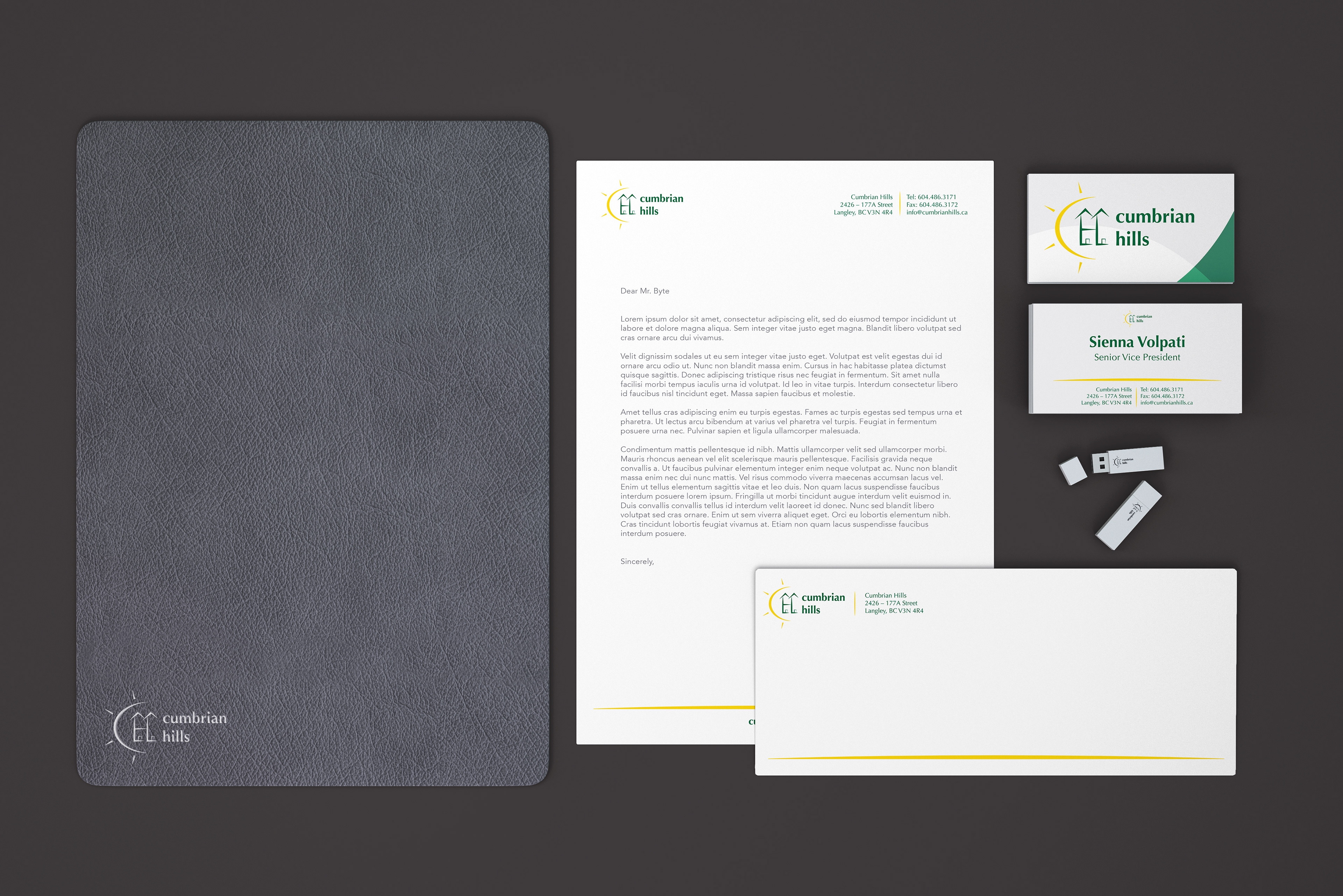
Logo + Stationary
BRIEF
Design a stationary package including a new logo, double sided business card, letterhead and envelope for a property development project called Cumbrian Hills.

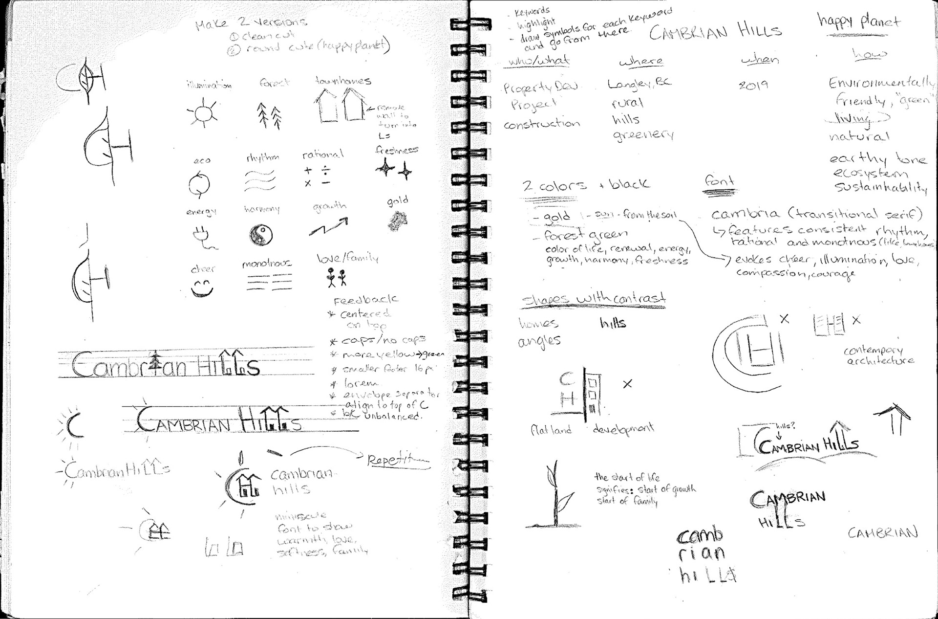
APPROACH
Being an environmentally conscious development, the color green was chosen to represent nature and a golden yellow to represent the sun. These colors combined with the use of all lowercase copy was chosen to show an overall warmth, softness, renewal and growth that comes with family and a new home. Lastly, shapes with contrasting characteristics were chosen to showcase the literalness of what the development is all about with round lines representing “Hills” and sharp right angles representing the precision of architecture. The C of "Cumbrian" is shown as the sun lighting up the H of "Hills" which forms two neighbouring homes.