Restaurant Branding
Brief
Create a new logo, food and wine list menu for a French inspired contemporary restaurant opening in Gastown Vancouver, BC.

approach
Logo Design
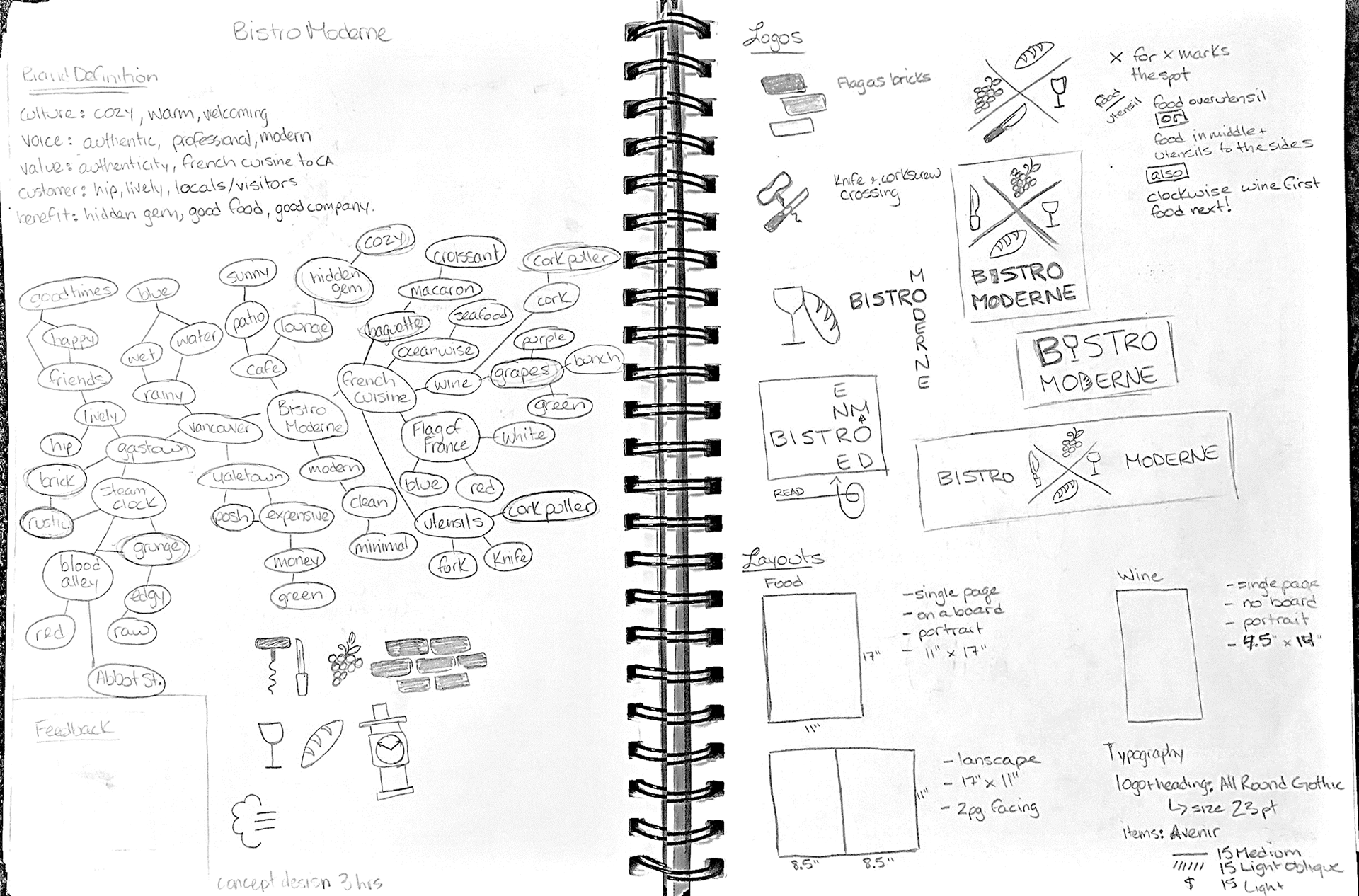
The words that jumped out in researching the essence of french cuisine were Baguette, Corkscrew, Grapes, Wine and Hidden Gem.
The words that jumped out in researching the essence of french cuisine were Baguette, Corkscrew, Grapes, Wine and Hidden Gem.
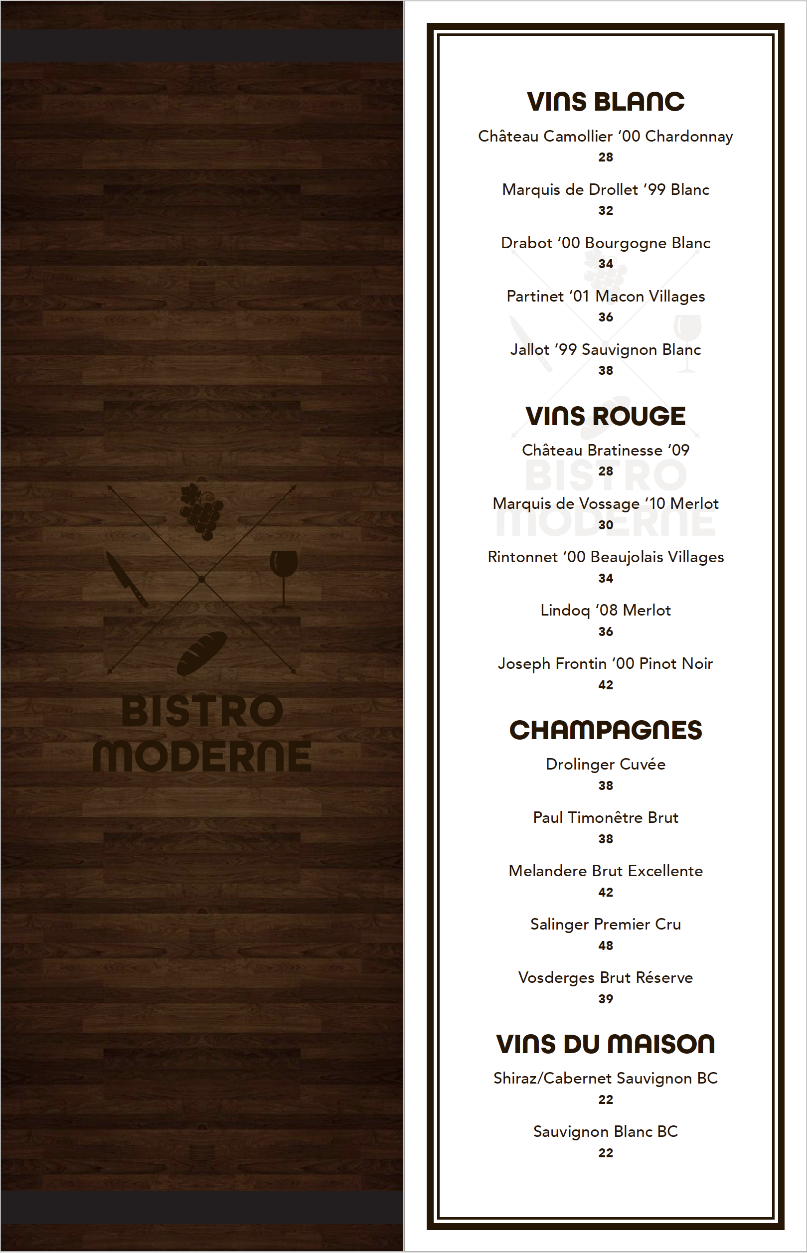
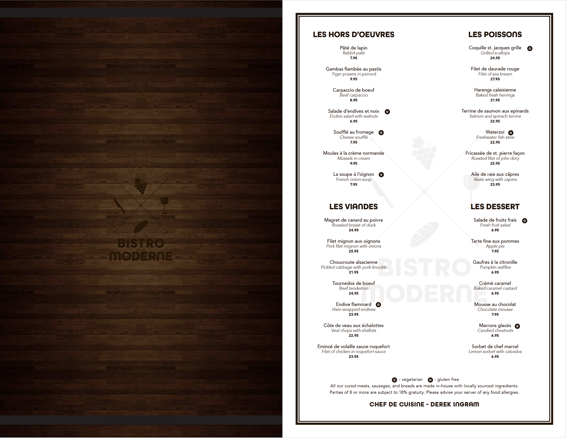
My goal was to represent France and french cuisine while staying away from using the obvious flag colors. The cross section (X) in the centre of the logo represents "X marks the spot" as Bistro Moderne is a hidden gem in Gastown. Having recently travelled to France I wanted to narrow down the food items for which they're most known and that brought me to bread and wine. Placing the food items in the centre quadrants represents the food that brings people together. The items in the outer quadrants are the corresponding utensils for those items. Additionally, and serendipitously, if you read the items clockwise starting at noon they go, "wine first, then food!"
Color Palette
A monochromatic dark brown color scheme was used for a contemporary look.
A monochromatic dark brown color scheme was used for a contemporary look.
Typography
The typefaces chosen are both san serif to maintain the bistro's contemporary identity. For the logo and headings All Round Gothic Bold was chosen, and for the menu items a mix of Medium, Light and Light Oblique from the Avenir family were used.
The typefaces chosen are both san serif to maintain the bistro's contemporary identity. For the logo and headings All Round Gothic Bold was chosen, and for the menu items a mix of Medium, Light and Light Oblique from the Avenir family were used.
LAYOUT
The finished product would be mounted on a wooden board with the back side of the board having the bistro's logo branded into it. The food menu board would be suited to fit an 11" x 17" menu and a 4.5" x 14" wine list.
The finished product would be mounted on a wooden board with the back side of the board having the bistro's logo branded into it. The food menu board would be suited to fit an 11" x 17" menu and a 4.5" x 14" wine list.